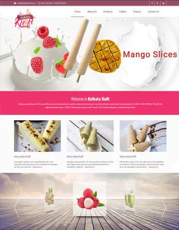
A colourful food-brand website presentation that introduces the Kolkata Kulfi identity, offering and customer contact information.
Project context
Food customers respond to appetising visual presentation, but they also need factual product, outlet or ordering information. The site should keep those details current and accessible on mobile.
This case study describes the visible design and communication approach represented in the NABR portfolio. It does not claim confidential performance figures, commercial results or technologies that have not been supplied by the client.
Client
KOLKATA KULFI
Sector
Food and desserts
Focus
Responsive website and clear customer journey
Design and experience priorities
How the website supports the business
01
Clear positioning
The opening content identifies KOLKATA KULFI and its food and desserts context quickly, giving visitors a useful starting point before they explore details.
02
Structured discovery
Information can be grouped into meaningful service, product or programme sections so people do not need to interpret a gallery or long undifferentiated page.
03
Responsive confidence
Readable typography, proportional media and direct navigation support visitors using phones as well as larger screens, including those arriving from search or shared links.
04
Useful enquiry path
Visible contact options and relevant context prepare a better conversation while avoiding intrusive prompts that interrupt visitors before they understand the offer.
Content, usability and search foundation
Search-friendly project presentation for KOLKATA KULFI begins with a unique page title, a descriptive heading, accurate food and desserts language and internal links from the main portfolio. Product, service, location and capability terms should be added only when verified by the business.
The structure guides visitors from an overview to relevant service or product information and then to a clear contact action. Descriptive headings, readable text, meaningful image alternatives and crawlable links provide a stronger base than decorative pages with little context.
Ongoing improvement should use evidence from Search Console, analytics, enquiry quality, mobile usability and client feedback. Any future results added here should be supported by verified measurements and an agreed reporting period.
Recommended ongoing checks
Keep product, service and contact information accurate.
Review mobile navigation and form completion regularly.
Compress new images and retain descriptive alternative text.
Measure qualified enquiries rather than traffic alone.
Need a website for your organisation?
Choose a design and development approach shaped around your audience and goals.